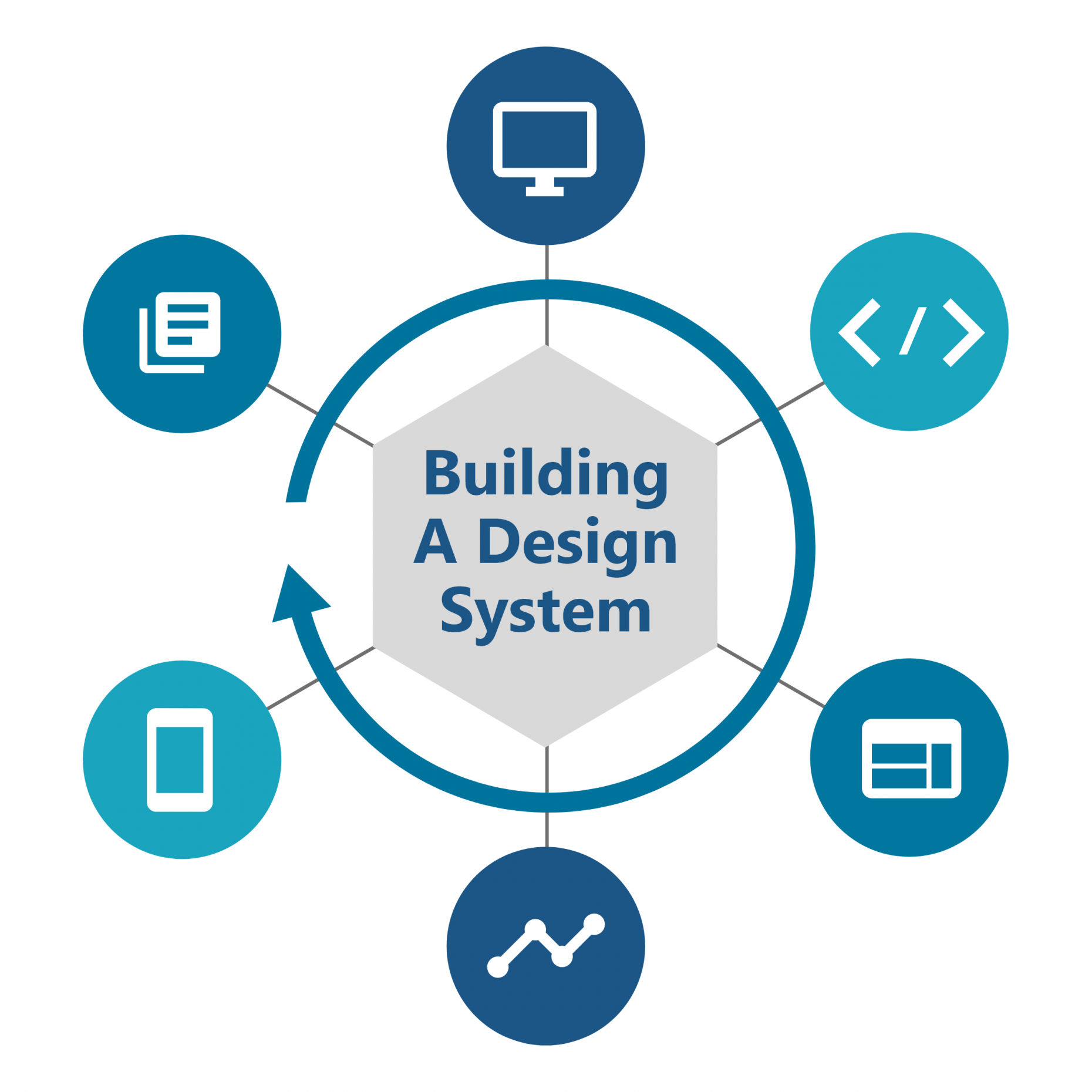
A Design System is an encyclopaedia for design and code. It consists of shared principles and values that build solid foundations to help align development and enable design teams to create greater consistency within their product library vision.
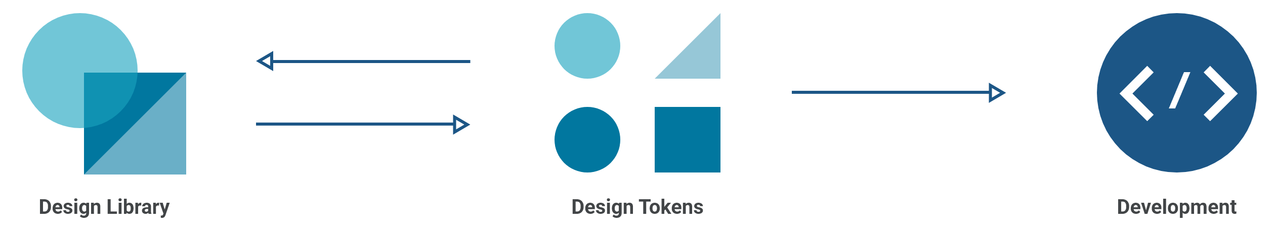
Design Library
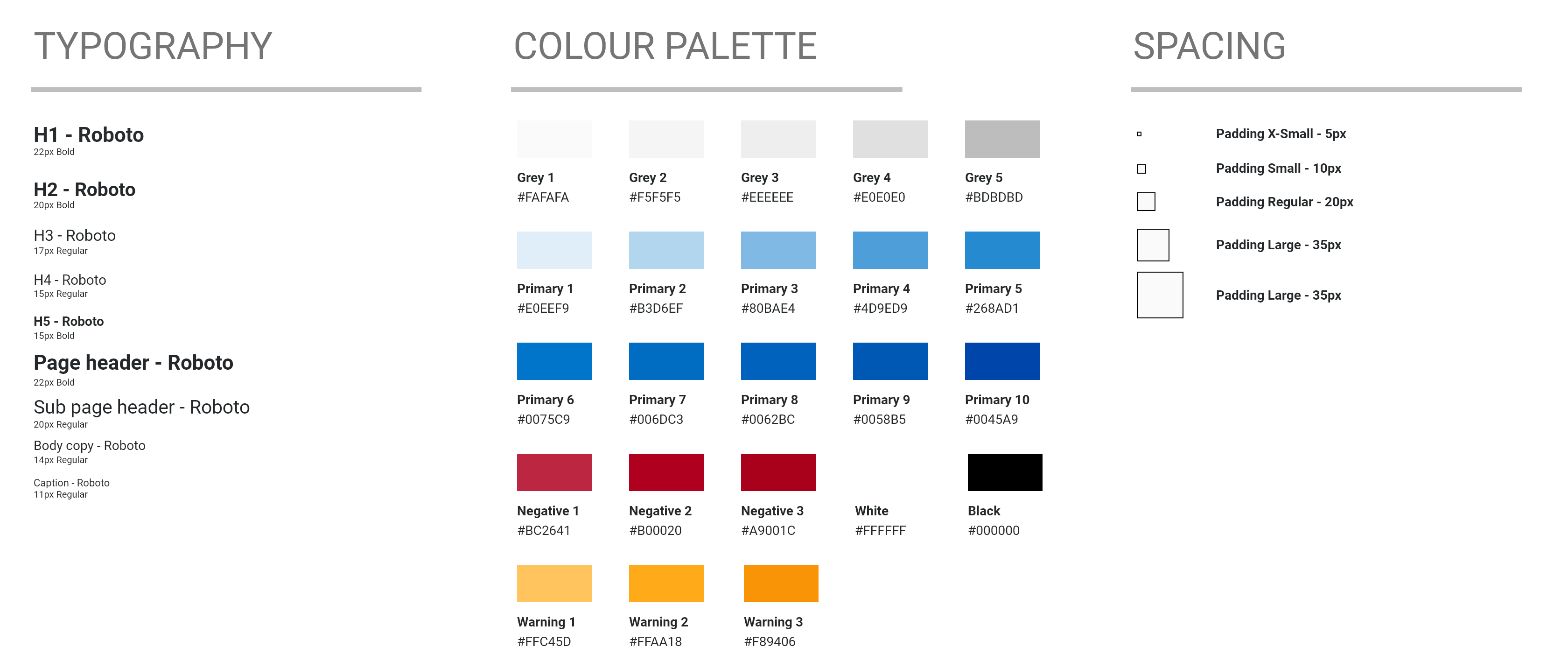
When creating a Design System, I start with the basic styles. I build and design a UI Design Library that includes all the styling attributes such as typography, colours and sizing, and I refer to these as primitive styles within the Library. Using primitive styling allows for greater consistency in our Design System.
Tools used: Adobe Xd – Figma – Sketch
Design Tokens
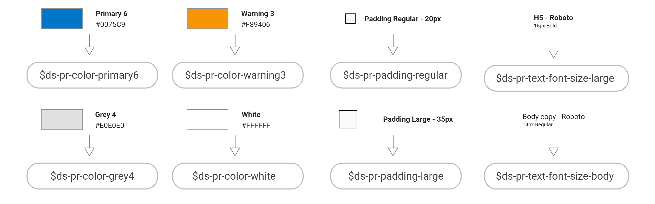
A Token is a variable that stores a single attribute and is assigned a name. With this Design Library, each colour, sizing variant and font attribute becomes a Design Token. For example, HEX code #E0E0E0, known as Grey 4 within our UI library, can be stored as a Token: $ds-pr-color-grey4: #E0E0E0
$ds-pr-color-grey4: #E0E0E0;
Token naming convention: ds=DesignSystem - pr=Primitive - color=Style grey4=AppropriateName
Tools used: Style Dictionary, Figma, Theo
Components
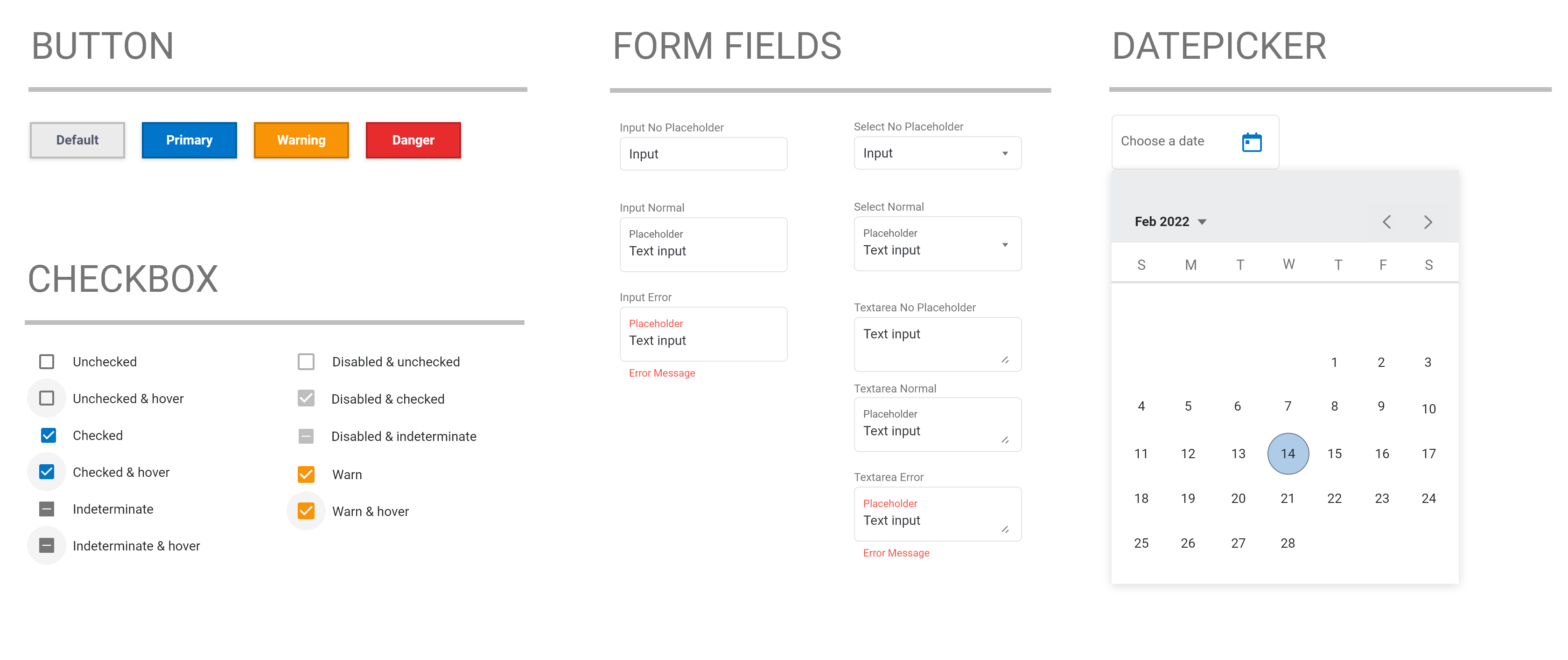
A Component is an object within an applications interface that can be reused in multiple areas. Having a reusable element allows for consistency and better accessibility for an end user. Each component has a specific purpose and principles related to it. For example, in a Design System we would have a Primary button which signifies to the user about a positive interaction, such as progressing to the next stage in a form or saving a file. Alternatively, we also include a Negative state button which would indicate to the user to go back in a form, or cancelling an interaction. Reusing these components across a product helps with the user experience as a user becomes accustomed to what colours mean and what components are for.
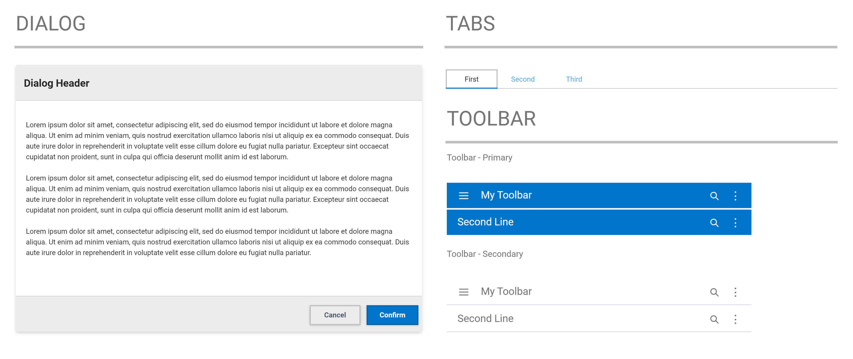
Anatomy Of A Component

Using Tokens For Components
Design Tokens are utilised within every Component in the Design System and are the key to its success. Tokens are not limited to a single code base as they are reusable, and this allows them to be created once and handle many different coding languages. For example, if I wish to create a Button Component and utilise Tokens to style it, I can use Tokens to make a standard button style, and then alter other attributes to make a similar button but fit for another purpose. This helps reduce the workload when creating a brand new Component.
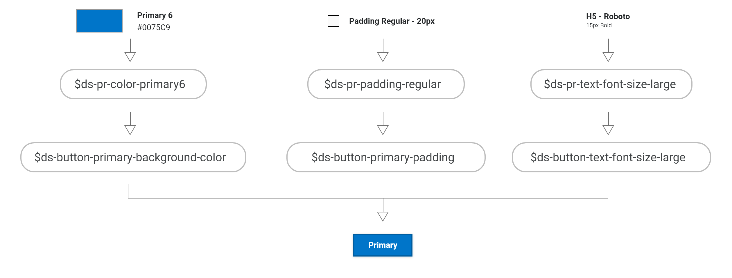
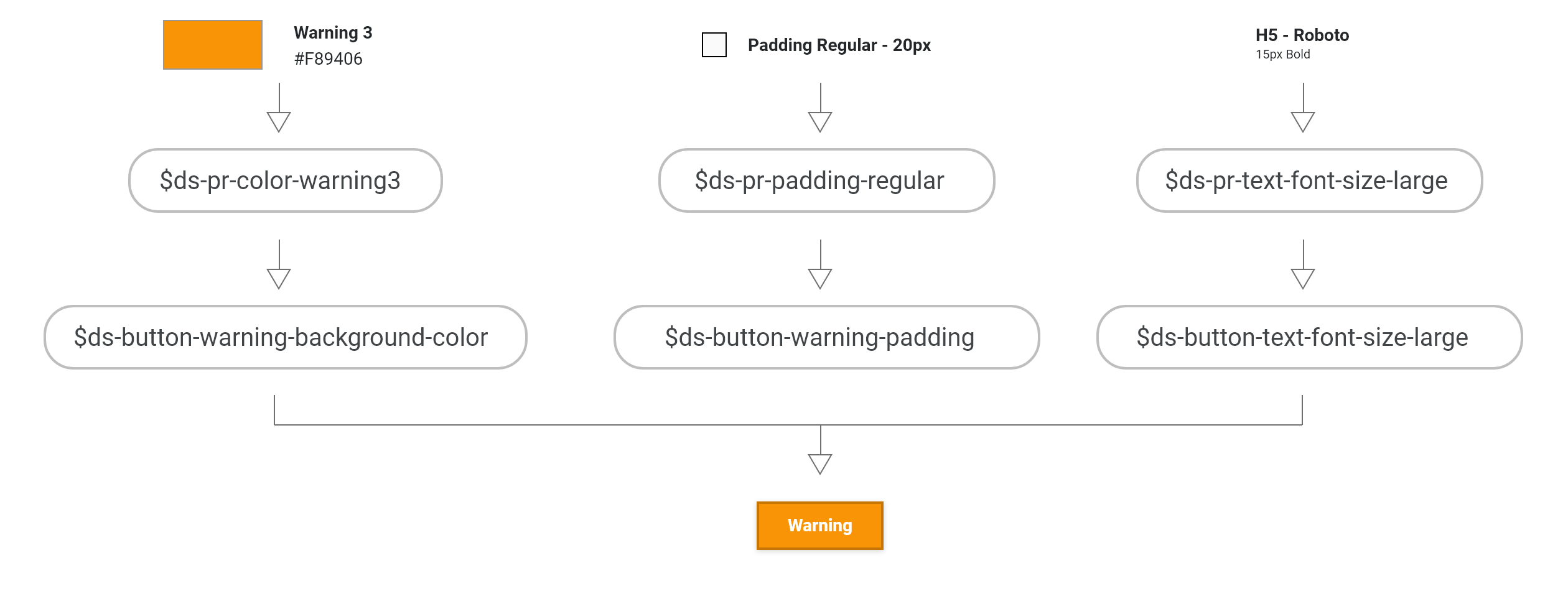 Example: The Primary and Warning buttons both share the same sizing and typography Tokens, while the colours are different.
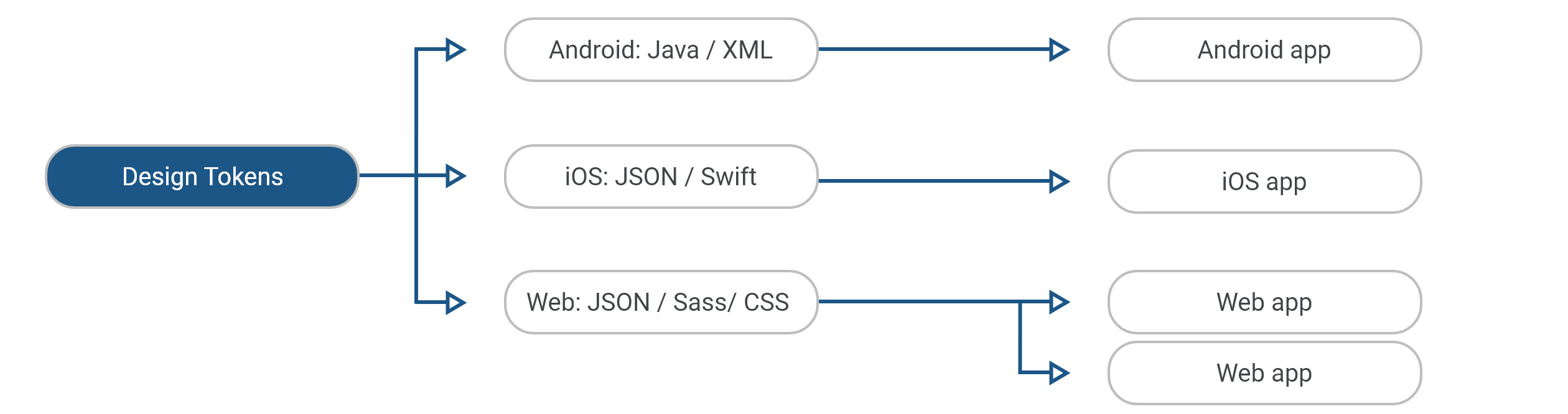
Style Once, Use Everywhere
We create our tokens and then pass them through to multiple platforms and languages. Reusable variables become one of the most powerful elements within our system. If we decide to change a token in the future, one simple change is reflected everywhere in the Design System.
Documentation & Handover
Design decisions and rules have to be well documented to keep a record of all the values and rules within the design system. Each Component will have its own set of rules and the code to implement it. The reason for writing up all this information is to support the various teams using a Design System, ultimately allowing for faster creation of applications and a better understanding of the system. Development teams can follow these guidelines for a Component, copy the appropriate code and implement it into their application, saving them time rather than creating a Component from the ground up.

Tools used: ZeroHeight – Zeplin – Storybook – Confluence – Self Hosted